
Wednesday, 3 May 2017
Tuesday, 2 May 2017
COP3 Research Proposal
Intro statement:
I chose this question because I'm interested in the communicative nature of illustration and design, and how image-makers can utilise this to create meaningful messages, spaces, schemes, ideas, and visual ephemera that goes beyond simply being about aesthetics and surface-level qualities.
I would like to explore historical examples of this further, such as Polish poster design and how the poster became a very culturally important art form, as well as contemporary examples of socially aware design that I may be able to align my own practice with.
Visual Journal | Changes
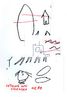
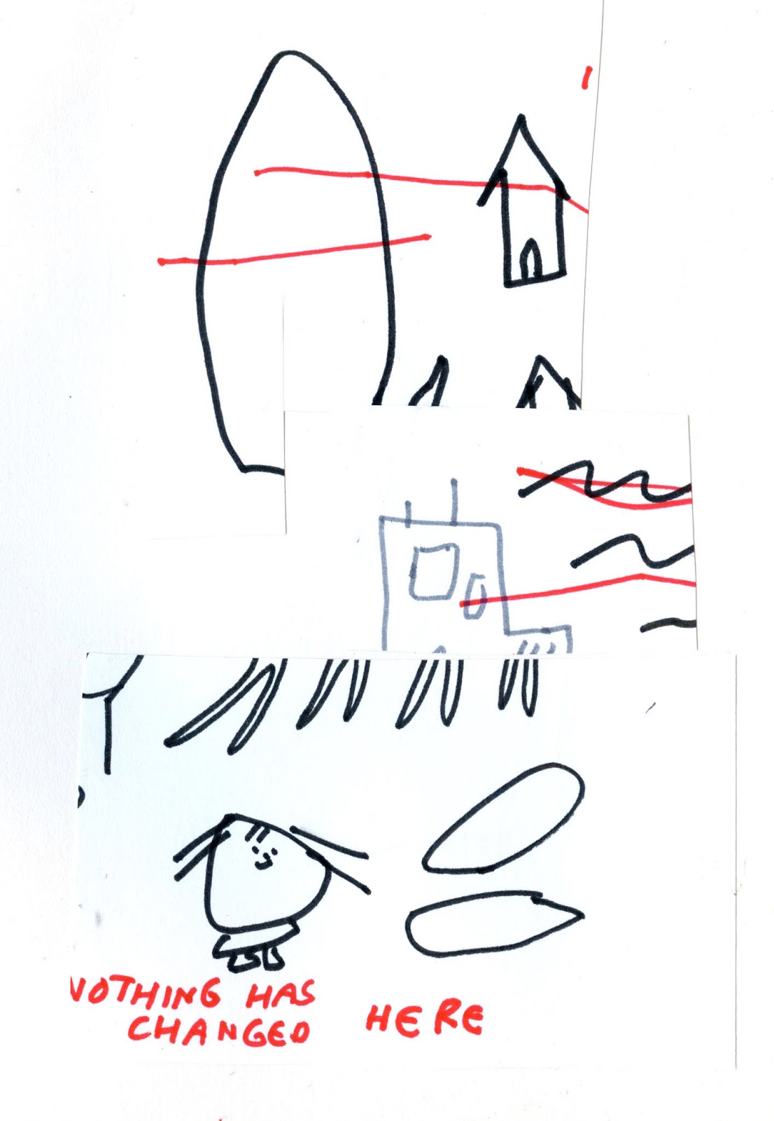
As I have progressed with my sketchbook work, I've enjoyed making images based on research and thoughts however at times I have had to think whether or not what I'm doing is working.
The more images I made, the more I distanced myself from region-specific/coastal imagery. This part was no longer important, however the personal aspect came more to the forefront.
Even though these pages look really scrappy, I've had more fun making the things that are more from a gut-feeling than when I've over thought something. I has been more about the small processes I've used, and the stream-of-consciousness thinking that occurs when I'm doing drawings.
Here are some of those pages...
I've also enjoyed creating collages from clippings of drawings I've already done. I do this a lot in my own personal sketchbooks, but it has been an apt way of creating images for this project. The final clipping collages are fragmented and hard to read, but still sort of resemble bits of the original drawing.


I suppose this relates to the whole memory/experience meaning of the pictures. It won't completely make sense to a viewer, but I understand the origins and content. Rearranging the smaller pieces into a new composition is also interesting to play around with too.
The more images I made, the more I distanced myself from region-specific/coastal imagery. This part was no longer important, however the personal aspect came more to the forefront.
Even though these pages look really scrappy, I've had more fun making the things that are more from a gut-feeling than when I've over thought something. I has been more about the small processes I've used, and the stream-of-consciousness thinking that occurs when I'm doing drawings.
Here are some of those pages...
I've also enjoyed creating collages from clippings of drawings I've already done. I do this a lot in my own personal sketchbooks, but it has been an apt way of creating images for this project. The final clipping collages are fragmented and hard to read, but still sort of resemble bits of the original drawing.


Larger drawing (above), three clipping collages (below)
I suppose this relates to the whole memory/experience meaning of the pictures. It won't completely make sense to a viewer, but I understand the origins and content. Rearranging the smaller pieces into a new composition is also interesting to play around with too.
10 Word Pitch Board

The keywords justify the practical work I undertook, from my process to the aesthetic of the work in my sketchbook. Everything I made was purposefully naive, and intuitive. I focused on the meaning behind the images, recalling places and memories as I made them. ( -> meaning over aesthetic)
The quotes were chosen because of their relation to my project, as well as their relation to my illustration practice and what I value in visual art. I like the idea of art being very personal at times, based on one's own experiences. As well as the idea that there is no criteria in order to make something, you just have to do it.
Study Task 5 | Initial Ideas - Definitions
Line - A long, narrow mark or band
Shape - The external form, contours, or outline of someone or something
Colour - The property possessed by an object of producing different sensations on the eye as a result of the way it reflects or emits light (hue, shade, tint, tone...)
Texture - The feel, appearance, or consistency of a surface or a substance
Collage - A piece of art made by sticking various different materials such as photographs and pieces of paper or fabric on to a backing / a collection or combination of various things


Colour - Colour influences the tone or feeling of an image, and sometimes what is conveyed. With digital processes almost any colour can be used, however historically only certain colours may have been available. Colours can also have political and cultural connotations.
Texture - Can be created through the use of different materials, as well as their application. Mark making, brush strokes, unusual surfaces, and materials like clay, fabric and 3D processes provide another textural element which is more physical/tangible.


Collage - A combination of many different elements. Can also give a sense of the real world when certain pieces are collaged (photographs, packaging, printed material, receipts, everyday things). A good process for bringing together line, shape, colour, texture if that is the desired effect.


Shape - The external form, contours, or outline of someone or something
Colour - The property possessed by an object of producing different sensations on the eye as a result of the way it reflects or emits light (hue, shade, tint, tone...)
Texture - The feel, appearance, or consistency of a surface or a substance
Collage - A piece of art made by sticking various different materials such as photographs and pieces of paper or fabric on to a backing / a collection or combination of various things
—
Line - The basis of drawing, can be gestural, or accurate, well-observed. Different line qualities can be achieve through the use of different tools and create different tones and moods.
"A drawing is an autobiographical record of one's discovery of an event - seen, remembered, or imagined" (Berger, 2007)


Ben Shahn
Shape - Very graphic and bold in appearance. Often creates a playful tone within an image. Although it can be quite restrictive too.


Antti Kalevi
Texture - Can be created through the use of different materials, as well as their application. Mark making, brush strokes, unusual surfaces, and materials like clay, fabric and 3D processes provide another textural element which is more physical/tangible.


Charlotte Mei


Tom Tyve
What visual element have I chosen?
In my sketchbook I began with line drawings and slowly integrated elements of collage - so the two were combined.
In terms of choosing one element to carry on with in my practical work, I think I will select collage as that counts for a lot of different methods and materials - and I can still drawing whilst including shape and other aesthetic qualities.
Here are some examples of sketchbook pages from early on in my book..
Subscribe to:
Comments (Atom)