Saturday, 30 April 2016

SB2 | ???

So not long before I received the feedback from the crit, I had briefly played around with the idea of applying patterns. This concept had been mentioned before but I had been really confused about how to do this in a meaningful way.


I had been looking at more of Nathalie du Pasquier's drawings and here she has applied her fun and vibrant surface designs on to small scenes and characters. I really liked these images, as well as her mock-ups of clothing designs.

They aren't perfect, and don't really have a purpose but I enjoy them anyway. They are playful and interesting to me because she made them for the sake of it. Another thing I admire about her drawings is that the execution doesn't have a lot of finesse, with the majority of them being felt tip pen or pencil drawings. This adds to their character I think.


I did some impromptu drawings of small people wearing patterns that I had made previously. I think they are funny and cute, however this direction is just confusing things more and broadening my work when really, I need to narrow things down.


This whole idea about application is really frustrating me because I feel that it could bring me closer to resolving my ideas but I don't know how.


I wrote a list of things that worked and things that didn't work. Although it isn't bad that I have a lot of ideas, I think at this stage in the project I need to draw things together and being exploratory is doing the opposite of this.

Friday, 29 April 2016

SB2 | Final Crit Feedback


The final crit was the last time we would receive feedback on our work so far, so it was valuable for someone to have an in depth look at what I'd been doing. Here are some of the comments I received:

1) Relationship between the content and practical responses

  Experimented with shape and implementing abstract aspects
  May be too broad, lots of things going on

2) Clarity of the link between visual responses and theory

  Theory is something similar to abstract not being a bad thing, and that connects really well as that's what your visual responses are about
  I can understand the architecture studies and the simplicity and abstract style was informed by artists

3) Visual quality of the practical responses

  Good quality (thanks Steven)
  Diverse use of media
  I'd like to see you draw on top of photos like the architecture experiments, using those big bold shapes

4) Issues that need to be addressed ahead of submission

  Have a clear objective
  You are making a lot of images but not illustrations

Comments from other peer / second half of crit

  Simplify designs, don't over embellish / complicate
  Resolve. Patterns, surface, application
  Narrow down ideas, focus on one thing

  Maybe you had to go through modernism to get to postmodernism?

My thoughts

I agree with a lot of the suggestions I was given! I have found this project difficult, and I feel that because postmodernism spans across so many different subjects and categories, so does my work! I have struggled to focus on a particular category. So I have done patterns, surfaces, drawings, architecture, and then even small character designs.

I can understand why this makes my project muddled and a bit all over the place. I need to refine my ideas, but at the same time apply them to something. I really enjoyed Nathalie du Pasquiers interiors and clothing designs. Could I do something similar without ripping them off? Would this answer the question of "applying" my ideas?

I will keep making images for the time being, continuing with surface for now. I do worry that just by making these images of surfaces they aren't amounting to anything 'resolved', even though I do enjoy making them and it is the process that informs them.

One idea from the crit was to recreate everyday scenes but with shapes / abstract forms - as this would draw together all of the loose ends of surface, pattern, buildings, spaces, maybe even people that I've began with.

Wednesday, 27 April 2016

SB2 | Collaging


So I was thinking more about buildings and I then thought about turning a very ordinary and boring scene into something different. The view from my window - iron, buildings a little further away, sky.

I took these things apart and then tried different arrangements to see what I could come up with. Playing with collage before gluing anything down was a helpful way of trying out many different layouts. I ended up with a lot more variations this way.


I'm not sure how successfully these function as images, but it was a fun way of creating ideas. Again, a process pushed these outcomes forward.

It would be interesting to see how these collages / photographs would translate into something more solid - paint, pen, digital - to see if they actually could work as flat colours and shapes that aren't movable.

SB2 | Buildings


I did some quick drawings of buildings based on some photos I took. Although I do like some aspects of them, I'm not sure how I will take these forward just yet. This was just me beginning to think about buildings more following some comments from the crit.

I like the loose line quality and the swift appearance. When I was drawing these, I had the Memphis sketches in mind. Their plans and sketches weren't entirely realistic either, however I liked their simplicity and boldness, that they were kept despite not being perfect.


Trying to introduce some other element with collage. Layers? Colour? Shape? I'm not sure. I'll have to think about these some more.

SB2 | Looking at more things


'Don't Take These Pictures Seriously 1981-87.' by Nathalie du Pasquier

Some really great images from this book, which compiles illustrations and designs made by the artist herself. From patterns, to furniture, product, and clothing designs, to poster concepts. The images have a real sense of fun to them, and they are so simple in their execution - with marks from felt tip pens and other materials visible in the finished designs.

I really enjoy seeing du Pasquier's work and I'd also like to create images that are simple yet effective, and don't look over-thought.


Architectural illustrations from Dutch designer and illustrator Leonie Bos. Arguably, their aesthetic is quite modernist in ways (structured forms, etc) - however I'm looking at them purely because they depict spaces and interiors and this is something I may do myself.

The illustrations mimic traditional print processes with the texture and layered appearance of the forms, however they are made digitally! Could they be considered postmodernist because they are a contemporary re-make of something quite classic? Maybe.

Monday, 25 April 2016

SB2 | Trip to the Library


Following the feedback from the crit, I had been re-thinking some aspects of my idea. I went to the library and got a couple of books out on Memphis design, hoping this would inspire me in terms of surfaces and how to apply them.


'This austere yet at the same time hyperkinetic interior boasts a rug designed by Ettore Sottsass, with a pattern that recalls-perhaps intentionally-the modern day hieroglyphs devised by New York artist Keith Haring.'


'Nathalie du Pasquier designed this molded plastic brooch for Fiorucci. The little dalmatian looks as if he could have blipped out from some video game. Although du Pasquier's outlook in her fashion designs is directly related to that which informs her furniture and fabric designs, the effect with something as ephemeral and downright "cute" as this brooch is not at all intellectual or self-conscious; it's just plain fun'


'This medley of American manufactured and designed tableware and bar accessories suggests just how widespread Memphis' influence has become outside of Europe. The pieces are: (clockwise) architect Laurinda Spear's buffet plate for Swid Powell; Sasaki's ice bucket for the "Prisma" collection; a glass from Toscany by Claudia Schwide; a cup and plate from Mary-James Inc.'s "Alpha 3 Dinneware"; a wine glass and a bar glass, both from Sasaki's "Prisma" collection; and a tabletop gift from Hutschenreuther.'


It was interesting to see sketches and process drawings for Memphis designs, how their hand-drawn plans were realised into 3D forms.


Further examples of Memphis product design


'Artists must show how to find originality, the unexpected and independence' (Ettore Sottsass)

SB2 | Peer Feedback & Self-Evaluation


The feedback session was beneficial because it was a chance for others to see what I'd done so far, and highlight the strengths and weaknesses of what I had in my sketchbook.

It seemed that people liked the use of different media, the range of tests and experimentation, the work with texture, and the deconstruction of objects.

I was relieved to hear that others thought that the breadth of work I had was sufficient. It's hard to place where I'm at since I hadn't seen anyone else's work up until this point.

People also provided some suggestions for where my ideas could go, which was very helpful. Here are some of them:

- Continue with digital testing

- Research some examples of Postmodernism and think about how you will take these patterns to the next stage. Are you going to apply them to everyday objects or scenarios?

- Introduce existing imagery, or architectural references

- Is presenting your ideas as patterns a 'modern' ideal?


This last point was really interesting, I'm guessing this meant that the structured appearance and order of a pattern was modern in that it was organised? Whereas postmodernism would lean more towards disarray.

Going from this, should I move on to mark making and surface to avoid repetition and order? I'll have to think on this.


I then had to evaluate my own work and progress. To me, the successes of what I'd done have been the experiments and the process-driven nature of them, allowing this to inform the designs / outcomes.

In terms of improvements I need to refine my ideas and move beyond just pattern, maybe even applying them. As a result of this refinement, my idea will be further developed.

During all of this I am learning that this type of project depends a lot on ideas and how they shape themselves. I think it's important that I stick with things in order to make the most out of them. I am also having to think about colour, shape, etc and how this all interacts in a space.

Wednesday, 13 April 2016

SB2 | Digital trials

Creating textures to use with digital experiments. Starting off with simple arrangements and basic colour schemes. I will make more complicated designs eventually.


Scanned pages of mark making with analog materials


Here are some examples of the digital experiments. I think the textural appearance of the brush marks works well against the flat colours. Just by changing the layer mode many different results can be achieved.

SB2 | Looking at Texture

Thinking of ways I could apply texture to forms. I could vary not only the appearance of the texture with different media, but the application could also change...


...is it cropped to a shape? Does it cover an entire shape? Are shapes removed from the texture? etc.


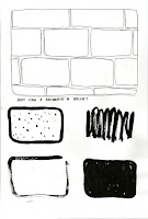
Going back to my earlier reference photos, I also think about the different ways in which I could represent something. How many ways can a rectangular form be created?