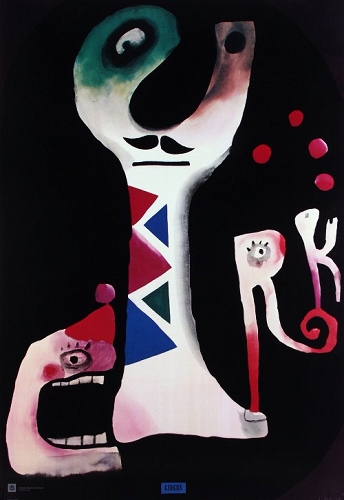
Extracts from this article on It's Nice That. Having read up on Polish poster design a lot of the past couple of week, I feel that the aspects which are most intrinsic to this movement's attitude to creative output which, in turn, effects its aesthetic, is experimentation and creative freedom. Although these characteristics can be found in other design, social, and cultural movements and phenomena, I want to continue to discover these and look more into how this lack of creative limitation and inhibition results in work that is often more authentic, and often can deliver a message more effectively. — Imperfection and experiments with a Xerox machine by Zach Hobbs
'[his] posters fizz with energy, embodying a spirit of independence and experimentation'
'Zach has an approach to design that lives in an age of "pre-internet weirdness". Drawing inspiration from "punk rock, UFOs, weird southern people, and the year 1987" '
'Many of Zach's works that combine typography and abstract character design are produced using a Xerox machine to create collages with a conscious imprecision and rich halftone patterns.'
'Zach's posters and illustrations have a DIY attitude that recall the work of artist Winston Smith's work for the Alternative Tentacles record label and combine a wicked sense of humour with a strong politic.'
- Graphic artist, painter, poster designer and illustrator
- In 1991, with Marek Sobczyk, set up the design company Zafryki, which produced amongst other things, illustrations for Magazyn Gazety Wyborczej, posters for the Variety Theater in Warsaw, graphic designs for books, logos and their own typefaces. pg. 412 - 'Mlodozeniec and Sobczyk work in many areas of modern visual culture - involved in both art and design, they paint pictures, create animations and videos, and design posters and graphics, logos and corporate images.' 'They also design their own typefaces and while operating under the name Zafryki, they created dozens of them. They design all kinds of publications, do the covers and illustrations for them, and often themselves handle the layouts.' pg. 414 - 'They treat typography with due deference, with texts and lettering undergoing numerous formal processes in order to beef up the impact of the message, whilst constantly looking for new, original solutions in terms of images.' 'Lettering most often interacts with the image provocatively, while creating a coherent whole. The distinctive Zafryki style is also simplicity and brevity.' 'In this conciseness of image and condensed visual language of simple forms, the artists leave plenty of room for viewer interpretation. Playing together with the recipient, with erudition, intelligence, and considerable experience in graphic signs and the latest trends on the street and in pop culture, they subtly insinuate concepts associated with high culture.'
1. Stach & Piotr Mlodozeniec Paintings (1977) 2. Prostokaty: Piotr Mlodozeniec i Pawel Szanajca (2012)
'Piotr Rypson wrote of Zafryki's activities as being the best that has happened in Polish graphic design since 1989. Stach Szablowski noted that in Zafryki's "applied arts", greater emphasis was always placed on the "art", and in this tendency saw the source of the duo's success.' 'Their careers began at a time of political turbulence with the formation of the Solidarity movement, followed by martial law. In that raised temperature of daily life, poverty and the mundane "problems of existence", important things were being said and done.' pg. 415 - 'Hastily duplicated publications were hardly legible, blurred and unclear, but bore strong and important messages. In popular culture, punk was as its peak, and the very air was energised. In the art world, the tone was set by new rebels and a new expression.' 'These visual and audible stimuli only fuelled the restless mood even more and corresponded ideally with the realities.'
1. Hamlet under Construction (2006) 2. Giselle Ballet (1995)
'In Polish art of the eighties, two artistic formations spoke with the loudest and bravest voice: Luxus and Gruppa. These artists used the irony and humour that throughout the years of socialism had allowed them to cheat the censor and live a little more freely.' 'Anecdote and narrative collided with the purely pictorial, and the artistic form of works evoked the avant-garde of the twentieth century, primitive art, graffiti, and the signs found in the city and everyday life.' 'Icons were simplified, powerful and expressive - for maximum communication.' 'Piotr Mlodozeniec, recalling this "underground" period of Poland in the eighties, emphasises how the then numerous limitations, not least the technological difficulties, influenced art: "They certainly imposed a specific style. In my case it was a tendency to work in black and white, abandoning colour. Most of our work was carried out using the silk-screen printing technique, and sometimes by means of templates that were convenient and easy to prepare at home. We used all kinds of ink, whatever we could get our hands on, such as Komfort washing paste mixed with printing inks. When you sneezed, half the print came away, but it had a certain charm. These early technological experiments sometimes translated into something that can be called style: a striving for simplification, fun and games with templates. Later, even though the technology progressed, we kept returning to this method, as in a way it proved a productive medium and provided good effects." 'Afterimages of this iconography of revolution in the eighties mingled with the pixels of the cyber world. They were among the first Polish artists to take up the challenge of computer screen art.'
- 1950, began work at the art editor for weekly satirical magazine Szpilki
- 1952-54, he was Tomaszewski's assistant at the Warsaw Academy of Fine Arts
- 1957 made his debut animated film Once Upon a Time... with Walerian Borowczyk, following the success of their joint film House which was awarded the Grand Prix at the Experimental Film Competition at Expo '58, Brussels
pg. 232 - One of the most important and influential Polish poster designers of the twentieth century, but his work was not limited to just this one discipline.
'It is to Lenica we owe the term "Polish school of poster," which appeared in the title of his article for the Swiss periodical Graphis.'
'His earliest posters, dating from 1953...remained faithful to the illustrative spirit of earlier masters of Polish graphic and book design.'
'...characterized by broad, painterly gestures'
Rio Escondido (1954)
'The 1954 poster for the Mexican film Rio Escondido, directed by Emilio Fernandez, is one of the artist's best early works, notable for its simplicity of form, colours and the freedom of its brush strokes.'
pg. 234 - 'Talking in the film The Island of Jan Lenica, the artist claimed that the phenomenon of Polish poster art, especially the film poster he helped to establish, was due to a particular kind of creative freedom enjoyed by the graphic designers at the time.'
'Nobody demanded that the designs they produced need sell anything. They could interpret the films or plays their own way. This was undoubtedly one of the paradoxes of communist reality.'
'By the end of the decade, Lenica had begun to seek new means of expression, which coincided with his undertaking, together with Walerian Borowczyk, the production of animated films, in which he used, among other things, the technique of collage and cutout.' 'In the sixties...the freehand patchy painting style of his (poster, but also film) work gradually began to give way in favour of a sinuous linearity reminiscent of Art Nouveau.'
'In another work from the end of the decade...Lenica made the already allusive sinuous flowing line almost abstract...But around this same time, he was creating designs that were more graphic, with strong contrasts and an economy of colour, often resorting to black and white.' 'A good example may be seen in two posters published in England, for Polanski's films Repulsion (1965) and Cul-de-sac (1966).
Repulsion (1966)
'Overall, Lenica's poster art can be described as evolving and developing along at least two parallel lines: an Art Nouveau style, with an emphasis on colour and coloured patches, and a more economical style, with strong contrasts, which was more graphic than painterly and closer to the artist's earlier drawings for the press.' 'However, the boundary between the two conventions is blurred and often we see a combination of the two, where sharply defined graphic elements are combined with painterly effects.' pg. 236 - 'An inseparable element of the artist's style was humour, sometimes bordering on sarcasm, and an unconventional approach to his subject.' 'Lenica's poster work always remained closely connected with his activities in other artistic fields: book illustrations, theater set design and above all, film-making.'
'When asked what he considered most important - film or art, the artist replied: "There is no gradation; I work in both these areas in parallel, in fact they are similar to each other. At first, I transferred some artistic solutions to film, and then later I used my film experience in graphic design, such as my posters.'
Behind the Poster (Druga Strona Plakatu), documentary film from here.
"A good poster should enter through the eye and explode in the brain"
- Cassandre
Waldemar Swierzy: Posters were the only colourful elements on the grey fences. There were still whole blocks of wooden-fenced ruins. They were the first poster galleries.
1. Makbet (1996) 2. Lawa (1989) Jan Lenica
Jan Lenica: The Polish poster was successful because it was different. It may sound absurd, but we worked in a complete artistic freedom. We could create posters, mostly for film, unique in all of Europe. It was a surprise, even a shock to some people, that a poster could be designed in that way. Alain Le Quernec: It's stupid to say that Polish poster was uniform. It didn't have a defined style. T.A. Lewandowski: After WWII analphabetism (illiteracy) was very common, pictures were a better medium than text. Josef Mroszczak, having the trust of the party and the ministry of culture, came to a brilliant idea after the success of the Polish poster in the West. "Let's create an event never seen before, an international exhibition, presenting the Polish poster amidst the best Western works". Mroszczak also came up with the idea to create the Poster Museum in Winalow.
1. Midnight Cowboy (1969) Waldemar Swierzy
Agnieszka Holland: It wasn't commercial like nowadays, it was an artist's point of view. The more personal, the more valued.
The poster artist is the last commentator of the film, just before the critic. He's a creative critic, placed between and me the spectator. Reality was so oppressive, and we used the language of metaphor to get through to them. Censorship taught us to communicate differently.
Andrzej Pagowski: This poster was forbidden in Poland, but our censors were two-faced. It was allowed abroad, this poster for the film Kung Fu was banned in Poland and shown only abroad so the regime could say "See how free our artists are". Pierre Bernard: Warsaw was a symphony of grey and black everywhere. The only thing standing out were the posters. It was like a painting exhibition, where all tendencies were present.
"You have to show something that isn't there, but your 'trick' has to be visible"
- Henryk Tomaszewski
Vertigo (1963) Roman Cieselewicz
Zdzislaw Schubert: Cieslewicz and Lenica emigrated to Paris. It's a good example of two different attitudes. Lenica was hermetically closed. What formed him as an artist in Poland, he took with him and he knew no compromise. He stayed himself. Of course, he evolved, but he was absolutely resistant to actual trends. Quite contrary to Cieselewicz, who absorbed like a sponge. Lech Majewski: Posters have evolved, because of TV, internet, new media, billboards everywhere but they can still find a place. Waldemar Swierzy: Today, the client is king. But the poster isn't made for him. It's made for the street, the client is a middleman, he's just the one who pays. But he thinks "I pay - I decide", and the results are easy to see. Pierre Bernard: Nobody sticks posters on street walls any more, now they hang in galleries. The problem is we lack free space. Once you could stick a poster in the street, not anymore. To be on the street you have to pay.
1. Love in the Afternoon (1957) 2. Spring, Autumn and Love (1956) Wojciech Fangor
- You have to find the energy to work with joy, not letting norms limit you, and regain the vitality of the Polish poster which developed in difficult conditions. Agnieszka Holland: The posters are so ugly, because the people are supposedly stupid. When a poster is artistic, it usually means the distributor doesn't care. In communist times, it wasn't about the money. There was more selflessness, and for me, this is the attribute of freedom in art. If art is done for money - it loses freedom. Roman Cieslewicz: This poster is information and agitation. A poster that doesn't irritate the human eye is not a poster.
- During his studies, also worked with the satirical weekly Szpilki. - 1947, began working with Polish Film (Film Polski), designing their posters. - The innovative style of these was recognised at the International Poster Exhibition in Vienna, 1948. - 1950, moved to Warsaw and worked for two years as the stage designer at Teatr Syrena. He also published drawings in Przeglad Kulturalny (1956-1962) pg. 164 - 'In 1947, Polish Film issued 13 posters by Tomaszewski for films, which at the time hardly needed advertising. 'In these works the designer in a completely novel way introduced lettering to the poster - often hand-written. The fusion of selected motif, powerful colour effects and virtuosity of brushstroke and lettering in a compositional whole is one of this Polish graphic artist's most important achievements, an approach that was later continued in the posters of many other artists'
1. Hadrian VII (1969), Dramatic Theater in Warsaw
2. Hamlet (1962), Dramatic Theater in Warsaw
pg. 165 - '...The artist presented the film's subject matter by innovative means unseen before in graphic design. Given the opportunity to watch a film in a pre-release screening, he tried to endow the poster with its atmosphere or present its subject matter symbolically.' 'During the most difficult period, prior to the political thaw in 1965, it was the Film Lease Headquarters that provided the greatest freedom in poster design. Here, no one imposed any formal solutions or exerted commercial pressure, the only requirement being that posters be legible and compatible with a film's subject matter.' 'Tomaszewski took full advantage of this laissez-faire policy, testing various formal solutions: in some posters he tried out the collage technique and included fragments of film footage in his composition...in others he applied only painting and drawing techniques' pg. 166 - 'One can see in the posters of this period, including those for plays and exhibitions, the different directions his research and testing took him, often still far from the extreme simplification of future compositions.' "Oh that Tomaszewski - a great bon vivant, fiendishly sophisticated! Always serves up so little, sometimes merely a few brushstrokes - but of what quality! What juxtapositions, so free, and at the same time so studied, nonchalant and synthesized, what a gamut of subjects, convetions and manners" - Andrzej Oseka 'his striving for maximum content with a minimum of form.'
Henry Moore exhibition poster (1959)
'As time passed, he abandoned the earlier attempts at collage and painting seen in his film posters, and gradually simplified the composition, ridding it of all unnecessary elements' 'One of the first designs of this type was the announcement of an exhibition of sculptures by the well-known British artist Henry Moore (1959), which the designer constructed from cutout letters, giving one of them the function of a pedestal under a Moore sculpture' 'His compositions are mostly built by means of freehand drawings with a brush, sometimes supplemented by a simple cut of the paper. He usually wrote the text to his posters by hand, but was also prepared to employ letters from a set of fonts, often combining the two types of text.' pg. 168 - 'In Tomaszewski we do not find simple and obvious solutions; even straightforward announcements of exhibitions feature a highly charged interpretation. This was his "claw", a way to intrigue the viewer, to get him to stop in front of a sheet of paper pasted on a street corner, because when carrying out work to order, that was what the artist saw as their proper place.' ' "The life of a poster", he would say "is like that of a butterfly. Anyone can rip it up, paste over it or destroy it. It is a transitory creature. It draws attention, attacks and amuses. It doesn't fit in with traditional publication - these aren't works designed to be contemplated, they aren't suitable for exhibitions." '
1. Ty i Ja, January cover (1968) 2. Ty i Ja, October cover (1968)
'In addition to drawings to order and those used as illustrations for magazines or books, he produced small sketches, among them caricatures, using felt-tip, ink, pen or brush. His designs can be found on the covers of the magazines Ty i Ja, Projekt and Polska.' 'He also designed several series of book covers for various publishing cycles presenting prose and poetry, including two series of covers for volumes of poetry released in the 1970s and 80s' pg. 169 - 'He always eluded any classification and evaded any divisions or pigeonholing of his work, faithful to that principle, which he maintained to the end: "My chief goal is to fit nothing and no one."
After the briefing yesterday, I was thrown into a bit of doubt on whether my research subject was strong enough. I often try to look at too many things, which can sometimes make it hard to focus a project down to something specific. The main points so far have been the following: > POSTERS as a platform for visual messages > POSTERS as a form of public art and their accessibility (out in the streets, etc) > with visual references of POLISH POSTERS and WILLEM SANDBERG
However I worry about this becoming a really dry subject, focusing too much on design specifics and the ins-and-outs of communicative image making? (e.g. a lot of rule following)
For someone who enjoys drawing, I'm struggling to see how I can integrate this into my research. Aspects of my research conflict in some ways, for instance looking at HIGH-BROW (museums and galleries, cultural institutions) with LOW-BROW / LO-FI illustration, which is what I personally enjoy. Do these work side by side? And as a result, the ideas of SUCCESSFUL COMMUNICATION (clear and concise designs, appealing to a mass-audience, understood by all) and slightly OFF-KILTER IMAGE-MAKING (avant-garde visual art, nonsensical tones, sometimes a bit alienating) which is much more cryptic, inciting intrigue rather than being too straight forward?
I made this diagram to try and see if all of these loose threads can connect together properly, but I'm not sure.
Maybe to switch this up into a more interesting way, instead of looking at "correct" design, I could look at references, movements, practitioners, sources that subvert communication design and image making? e.g. David Carson's type work...(but try not to make it too graphic design-based)
For now, I will continue to gather various sources of information that I think are relevant and interesting, and hopefully in the peer sessions next week, people can tell me whether or not I've went overboard and if it makes sense.
edited by Jacek Mrowczyk Introduction - 'These (chapters) describe the graphic design of the period in the wider context of its material culture and the technological, social and political changes that abounded in Polish twentieth-century history' *Against All Odds - Piotr Rypson (history of Polish graphic design between 1919-1949) 1900-1945 First Generations (Piotr Rypson)
pg. 12 - Poland in the early twentieth-century was not featured on the map of Europe, being parceled into three partitions and subject to various political, economic, and cultural influences. The most liberal of these areas was the Austrian partition, and Krakow, the capital and seat of polish kings, served as the symbolic center of this supposedly non-existent country, with a significant part of Poland's artistic, literary and publishing activities being concentrated in that city. 'However, the Krakow and Warsaw publishing centers were insufficient for a more dynamic development of graphic design - what was needed were state-funded public servicecommissions and modern, capitalist advertising. These two driving forces were only launched a dozen or so years later, with the advent of the reborn Polish state. pg. 13 - 'Poland reappeared on the map of Europe in 1918. The architects of the new state faced the mammoth task of merging three culturally different territories devastated by war, lying within borders that had undergone alterations and revisions by force of arms, ethnically very diverse and shaken by internal and external destabilizing forces.
pg. 17 - 'In the development of graphic design, a breakthrough came with the organisation of the Polish General Exhibition in Poznan, marking the tenth anniversary of Poland's regained statehood 1945-1980 Freedom Under Control (Krzysztof Lenk) pg. 136 - 'Poland spent the years 1945-1949 liquidating the remains of its military and civilian underground networks that answered to the London based government-in-exile and extending communist control over all areas of life.' 'Pre-war printing houses reopened; and new, large, state and party controlled publishing houses were established...[with the] Military Press specialising in political propaganda' 'The Czytelnik publishing house began mass production of books, magazines and newspapers. These publishers were an important source of assignments for graphic designers.' 'Cultural policy, relatively open in the early postwar years, introduced greater restrictions along with the escalation of the Cold War and in the years 1948-1949, the enforcement of a doctrine of socialist realism in art.' 'Private publishers were closed down, while theaters and cinemas were nationalised. An omnipotent board of censorscontrolled all means of communication, right down to the labels on canned foodstuffs.' pg. 137 - 'The influence of "degenerate and formalistic Western art" was banned and domestic arts became a tool of political propaganda. Universities and academies sacked many outstanding scientists and artists for being critical of the new doctrine.'
The Party, for KC PZPR (1955) Wlodzimierz Zakrzewski
'A special role at this time was played by the military's Front Poster Studio (Pracownia Plakatu Frontowego), headed by Wlodzimierz Zakrzewski, a painter educated in the USSR.' 'At the beginning of 1945, Tadeusz Trepkowski went to work in this studio and briefly, Henryk Tomaszewski. For the first time there arose a confrontation between two types of presentation in posters: realistic painting modeled on Soviet visual propaganda, as promoted by Zakrzewski and the party designers gathered around him, and the symbolic and metaphorical style represented by Trepkowski. This conflict lasted until the thaw in the mid-fifties.' 'The older generation of poster and book cover designers, who had pre-war careers and recognition behind them...were now joined by a group of younger artists who had made their debuts shortly before the outbreak of war'
1. Apache (1957), Wojciech Fangor 2. Hiroshima, My Love (1960), Stanislaw Zagorski
pg. 138 - 'In 1946, the deputy manager of Polish Film's ad department, Hanna Tomaszewska, invited the cooperation of a group of young designers and agreed to the artistic conditions they laid down... Henryk Tomaszewski, Eryk Lipinski, Tadeusz Trepkowski and Wojciech Zamecznik opened a new chapter in the history of Polish film poster design.' pg. 140 - 'In the field of culture, the first half of the fifties saw intense attempts at Russification and "alignment" to the model adopted in the USSR.' 'Attempts were made to create a uniform, centrally "approved" language of visual propaganda - a language of realistic presentation of content, comprehensible for the "man in the street". Information was to be communicated by means of aggressive and easily remembered political slogans, enhanced by illustration' pg. 141 - 'In the second half of the fifties, the political poster evolved from an agressive attack against enemies of the state and attitudes hostile to the regime to include more celebratory functions, permitting a broader range of artistic solutions and a greater degree of individualism and decoration.' 'Around 1954, a new language for Polish movie, theater and exhibition posters crystalized, well grounded in expressionist painting, free of the literal representation characteristic of political and commercial posters, later often to be known as the Polish school of poster.' 'This language appealed to viewers' imaginations, and slipped in associations related to their experience.'
1. The Barricade (1958), book cover, Marian Stachurski 2. Boomerang (1968), book cover, Mieczyslaw Kowalczyk
pg. 142 - Zdzislaw Schubert wrote: "The poster ceased to be just a dry communication of the subject - it became, through the artist's intrinsic reflections, an interpreter and commentator on the subject. ...This resulted from the poster's treatment as an artistic discipline, intended to fulfill specified utility functions - and not merely as an instrument for conveyance of information employing artistic means...' 'In the Polish People's Republic, in its most ambitious examples, the poster began to function as a specific field of the arts, ruled by its own laws... .Polish artists showed that the poster may be, in spite of its limitations, an equally sensitive, aesthetic and deeply meaningful instrument in expressing its designer's attitude to the surrounding reality, like every other discipline of art." 'Polish posters were noticed and entered international circulation. Exhibitions of "merry" posters began touring the world, counteracting in the minds of the public the stereotype of Poland as a grim communist country behind the Iron Curtain.' - International Poster Biennial in Warsaw (founded 1966) - Poster Museum in Wilanow (in 1968)
Posters and Society - The Popular Idiom pg. 183 - 'A poster can never be obscure. The designer cannot allow his work to express a private idea that subsequent generations may be able to unravel: he must achieve instant contact.'
(How much can this be pushed/subverted?
Does an instant message really need to be achieved??)
'To do this he must, like an entertainer, work with his audience. In many cases it becomes necessary to speak to the unprofessional audience in a popular way, although there are also times when an audience expects a degree of technical brilliance' 'Posters frequently reflect the popular idiom because their function is to communicate as well as to be decorative.' 'Because visual communication is the first justification for their existence, it is the character and extent of popular influence on their appearance that establishes the peculiar nature of posters as such.
Having Reached a Climax at the Age of 29, I Was Dead (1965) Tadanori Yokoo, exhibition poster
In fact, it is in this area of expression that one finds the essential qualities of the poster as opposed to its near relations, the painting or the graphic image.' '...the appearance of posters is mainly governed by professional artistic factors: that is to say, fashions in style and means of expression.' 'It is often thought that posters are necessarily a compromise of artistic styles, but we have seen that they frequently express visual ideas as well as paintings have done. In fact, posters have sometimes affected the other arts'.' 'When this reciprocal process has occurred, it is precisely the popular aspect of poster design that has caught the imagination of painters, for it is the expression of the popular idiom that gives the poster its unique place in the arts.' 'The popular idiom has two main directional currents. One flows upwards from the level of folk art and brings with it a common factor of integrity and a certain naivety. The other current flows downwards and is usually called mass culture; it is commercial or political propaganda, generally pre-digested and made palatable for mass-consumption.' pg. 184 - 'But whatever the nature of its sources, the poster in the popular idiom speaks the language of the mass of spectators - whether it contains the naivety of folk art or the pretentiousness of Kitsch.'
La Terrible Noche (1890) Jose Guadalupe Posada
'The popular poster seems to have proceeded from one situation towards the other...we can begin to examine its history with the earliest pictorial designs, such as the nineteenth-century gallows literature, consisting of popular melodramatic material, which has its counterpart in lively circus, fairground and bullfight advertising.' Posters and Comedy
pg. 204 - 'Its application is also universal, and light-hearted foolery, like the presence of a court jester, is a valuable outlet in a complicated world' pg. 226 - 'During the 1920s and '30s, the comic strip and the movie cartoon became new influences in visual humour, and these two elements were apparent in poster design.' 'In 1927 Savignac produced his cartoon-like design, Mon Savon: the extrovert, simple idea of the image has been used ever since by designers wishing to produce a clear-cut expression to show surprise, delight, astonishment, happiness and so on.' pg. 214 - 'A similar approach to humour was followed later by designers in England: the work of Tom Eckersley and Abram Games followed the same pattern'
The Exterminating Angel (1968) Heinz Edelmann
'In the years following the war this type of design continued to represent the principal means of expressing a comic situation. But there was a sharp change in the nature of humour itself during the 1950s, which has continued to develop. This use of 'black' or 'sick' humour.' pg. 215 - 'With the increased general interest in the bizarre, the images in posters during the 1960s became more far-fetched, and attempts to shock, or to reveal a lack of inhibition on the part of the advertiser or designer, left nothing to the imagination/' pg. 216 - 'The Underground Press, with posters by artists like Martin Sharp, produced pornographic versions of vernacular humour, most of which took on exaggerated fantasy. Many of these posters are amateurish in appearance' 'A great deal of the humour in the Underground posters is playing on the contrast between this new alternative society and the Establishment - in order to show how unrestrained one side can be in contrast to the monstrous character of traditional social order.'
War is good business - invest your son (1968)
Seymour Chwast
Politics, Revolution and War pg. 222 - '...Even until the 1950s, political posters could still appear to be orientated towards the idea that they are only part of commercial persuasion or an 'artistic' form of advertisement. Perhaps the anachronism is best illustrated in Seymour Chwast's satirical anti-war poster (above)' 'We are therefore faced with two distinct phases in the history of the ideological poster, the first from 1870 to 1919, when advertising for war was considered in terms of commercial advertising...' '...and the second phase, from 1919 until the present, when the true political poster started to make its appearance.' pg. 226 - 'In 1919 a new type of poster appeared there (Russia) which is said to have been the work originally of Mikhail Cheremnykh. It was known as the 'Satire window of the Russian Telegraph Agency' [usually abbreviated to ROSTA.]'
ROSTA Windows (1941) Vladimir Mayakovsky
'The windows consisted of illustrations with captions that resemble the cinematic sequence of the comic strip. The most famous of these designs are those made by the poet Mayakovsky: some of them include up to fourteen narrative illustrations which captions like sub-titles...' '...the influence of the sacred icon and the lubok (a Russian folk-art design, popular until the end of the nineteenth century)k with its combination of text and illustration' pg. 231 - 'From this connection Mayakovsky, who had become associated with the renewed interest in native folk-art traditions, himself developed this remarkable combination of poetry and image.' pg. 238 - 'The work of collective organisations in producing posters appeared again in Republican and Communist posters in Madrid and Barcelona during the Civil War in Spain. Posters during the Civil War demonstrated new techniques, such as photomontage.' pg. 242 - 'Since 1945 a significant change in world opinion about war has caused a great deal of publicity to be given to anti-war posters.'
May 68: The Beginning of a Prolonged Struggle (1968) Atelier Populaire
pg. 244 - 'The Paris rising in May 1968 was such an occasion, and after a hundred years of respectable development the poster suddenly appeared as a young, virile medium in the city where it had first been developed.' 'The posters have the character of hastily prepared broadsheets: they brought back a feeling of urgency to a medium that, for instant information, had been superseded by radio and television. If coverage is not available on the complicated technical system of mass communications, then posters can have a strong effect - especially if they return to their primitive stateinstead of being the tasteful art works to which the public have become accustomed.' pg. 245 - 'The posters of the Atelier Populaire had the direct impact of word and image; and the whole series maintains the traditions of good poster design - the popular sign and the broadsheet from which the medium grew.' 'By the end of the 1960s it became apparent that the development of poster design through the channels of commercialism had now found a strong alternative area of expression - in the posters of ideologies, whether these represented political ideologies or the ideals of a new generation.'
1. Day of Solidarity with Venezuela (1969) Faustino Perez 2. Disappearance of Ben Barka (1971) Antonio Fernandez
pg. 247 - 'The posters of the Cuban Revolution have become justly famous, and the most interesting aspect of this sudden flowering of talent lies precisely in the duality of posters that borrow their style from the West and their message from the East.' 'Cuban designers have been given much more freedom of expression than one has come to associate with a society based on Communism.' 'Their posters include frequent quotations from the commercial advertisement and from psychedelic, Pop Art, comic-strip and film posters of the United States consumer society.' pg. 256 - 'Art of the people and art for the people may be two different areas of expression. The poster is the means of conveying both graphic messages; whatever its claims as art it must first speak to the people'