

Der Soldat (1966)
- 1950, began work at the art editor for weekly satirical magazine Szpilki
- 1952-54, he was Tomaszewski's assistant at the Warsaw Academy of Fine Arts
- 1957 made his debut animated film Once Upon a Time... with Walerian Borowczyk, following the success of their joint film House which was awarded the Grand Prix at the Experimental Film Competition at Expo '58, Brussels
pg. 232 - One of the most important and influential Polish poster designers of the twentieth century, but his work was not limited to just this one discipline.
'It is to Lenica we owe the term "Polish school of poster," which appeared in the title of his article for the Swiss periodical Graphis.'
'His earliest posters, dating from 1953...remained faithful to the illustrative spirit of earlier masters of Polish graphic and book design.'
'...characterized by broad, painterly gestures'

Rio Escondido (1954)
'The 1954 poster for the Mexican film Rio Escondido, directed by Emilio Fernandez, is one of the artist's best early works, notable for its simplicity of form, colours and the freedom of its brush strokes.'
pg. 234 - 'Talking in the film The Island of Jan Lenica, the artist claimed that the phenomenon of Polish poster art, especially the film poster he helped to establish, was due to a particular kind of creative freedom enjoyed by the graphic designers at the time.'
'Nobody demanded that the designs they produced need sell anything. They could interpret the films or plays their own way. This was undoubtedly one of the paradoxes of communist reality.'
'By the end of the decade, Lenica had begun to seek new means of expression, which coincided with his undertaking, together with Walerian Borowczyk, the production of animated films, in which he used, among other things, the technique of collage and cutout.'
'In the sixties...the freehand patchy painting style of his (poster, but also film) work gradually began to give way in favour of a sinuous linearity reminiscent of Art Nouveau.'
'In another work from the end of the decade...Lenica made the already allusive sinuous flowing line almost abstract...But around this same time, he was creating designs that were more graphic, with strong contrasts and an economy of colour, often resorting to black and white.'
'A good example may be seen in two posters published in England, for Polanski's films Repulsion (1965) and Cul-de-sac (1966).

'Overall, Lenica's poster art can be described as evolving and developing along at least two parallel lines: an Art Nouveau style, with an emphasis on colour and coloured patches, and a more economical style, with strong contrasts, which was more graphic than painterly and closer to the artist's earlier drawings for the press.'
'However, the boundary between the two conventions is blurred and often we see a combination of the two, where sharply defined graphic elements are combined with painterly effects.'
pg. 236 - 'An inseparable element of the artist's style was humour, sometimes bordering on sarcasm, and an unconventional approach to his subject.'
'Lenica's poster work always remained closely connected with his activities in other artistic fields: book illustrations, theater set design and above all, film-making.'


'When asked what he considered most important - film or art, the artist replied: "There is no gradation; I work in both these areas in parallel, in fact they are similar to each other. At first, I transferred some artistic solutions to film, and then later I used my film experience in graphic design, such as my posters.'
'In the sixties...the freehand patchy painting style of his (poster, but also film) work gradually began to give way in favour of a sinuous linearity reminiscent of Art Nouveau.'
'In another work from the end of the decade...Lenica made the already allusive sinuous flowing line almost abstract...But around this same time, he was creating designs that were more graphic, with strong contrasts and an economy of colour, often resorting to black and white.'
'A good example may be seen in two posters published in England, for Polanski's films Repulsion (1965) and Cul-de-sac (1966).

Repulsion (1966)
'Overall, Lenica's poster art can be described as evolving and developing along at least two parallel lines: an Art Nouveau style, with an emphasis on colour and coloured patches, and a more economical style, with strong contrasts, which was more graphic than painterly and closer to the artist's earlier drawings for the press.'
'However, the boundary between the two conventions is blurred and often we see a combination of the two, where sharply defined graphic elements are combined with painterly effects.'
pg. 236 - 'An inseparable element of the artist's style was humour, sometimes bordering on sarcasm, and an unconventional approach to his subject.'
'Lenica's poster work always remained closely connected with his activities in other artistic fields: book illustrations, theater set design and above all, film-making.'

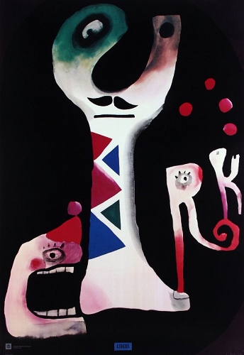
1. The Devils, theater poster (1971) 2. CYRK, circus poster (1971)
'When asked what he considered most important - film or art, the artist replied: "There is no gradation; I work in both these areas in parallel, in fact they are similar to each other. At first, I transferred some artistic solutions to film, and then later I used my film experience in graphic design, such as my posters.'
No comments:
Post a Comment